
Brand identity,
Animation,
at hAAi
Small details add playfulness to the brand
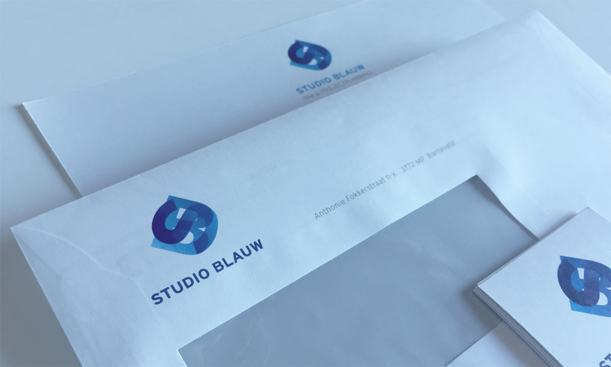
Creating a new brand from scratch isn't always a straightforward process. Sometimes a new organisation simply inherits its core values. On other occasions someone embarks on a entire new adventure. On their own. On a blank canvas, or in this case: a blue canvas. Such an occasion was the launch of Studio Blauw.
The 'Studio'-part of the name was decided upon to set the new brand apart in a field where many people operate under their own name. The 'Blauw' (Dutch for blue) was chosen simply for the owner's affinity with the color.
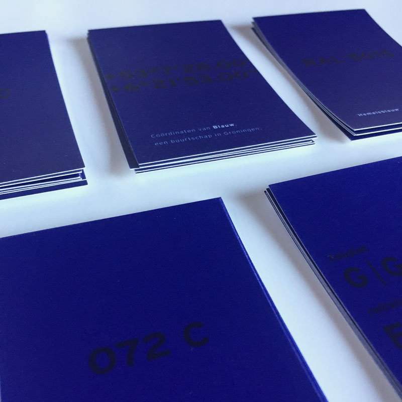
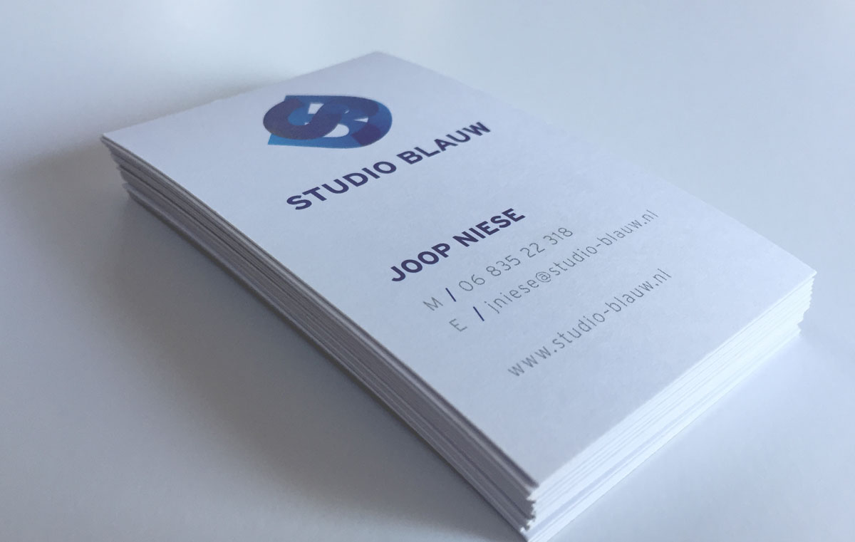
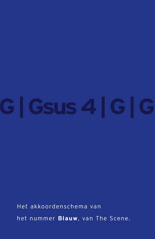
Getting all the details right is one of Studio Blauw's strong points. So after sticking to a simple but distinctive name we put the details back in for, well, the detailing. Each business card has different details on the back, related to 'blue'. That can be either a song, a location, a pantone color, et cetera. Something playful in a pretty serious world.
The logo is a modern monogram in which S and B are melted together. It represents the dynamic of building processes, both in a static and an animated version.


Get in touch